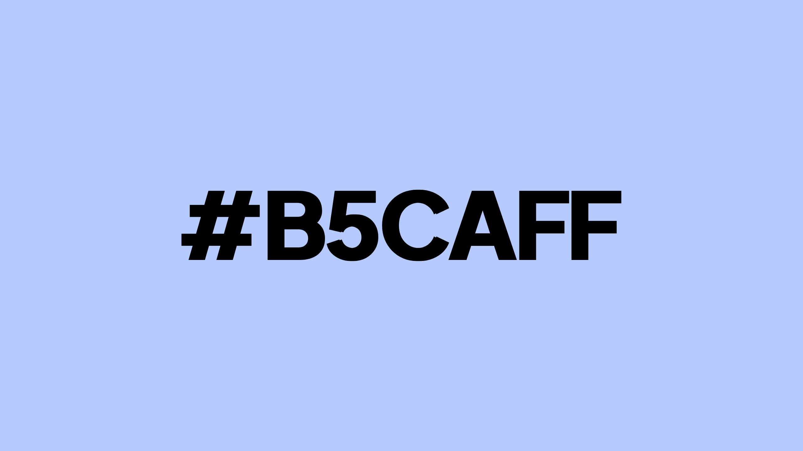
Moonstone Lake.
SCHWARZENERDER’s prism: Moonstone Lake (#b5caff), where calm meets defiance in an artificially luminous spectrum. Radiating a serene yet futuristic energy, this pale blue evokes moonlight refracted off a synthetic ocean in a dystopian dreamscape. Its subtle glow bridges the natural and the engineered, embodying our technoclean aesthetic. Intertwined with dystopia, robotics, and high-brow sci-fi themes, it anchors the blog’s vision of a world in flux. Beneath its tranquil surface lies an electric undertone—a quiet rebellion, a spark of innovation—that resonates with our ethos of future-forward exploration.
Here are the granular details of our signature color scheme.
General Information
- Name: Moonstone Lake.
- HEX Code: #b5caff
- Category: Light pastel blue, falling under the cool colors category.
- Color Family: Blue
RGB Breakdown
- RGB: (181, 202, 255)
- Red (R): 181 (71% intensity of the red channel on an 8-bit scale)
- Green (G): 202 (79% intensity of the green channel on an 8-bit scale)
- Blue (B): 255 (100% intensity of the blue channel, the maximum possible)
- Perception: The high blue value dominates, giving the color its cool, light tone.
HSL Breakdown
- HSL: (220°, 100%, 86%)
- Hue (H): 220°
- Position on the color wheel, placing it firmly in the blue spectrum.
- Indicates no visible red or yellow tint, emphasizing a pure blue tone.
- Saturation (S): 100%
- Fully saturated, making it a vibrant and bold blue with no grayness.
- Lightness (L): 86%
- A very high lightness, giving it a pastel, soft, and airy appearance.
- Hue (H): 220°
CMYK Breakdown
- CMYK: (48, 35, 0, 0)
- Cyan (C): 48%
- Magenta (M): 35%
- Yellow (Y): 0%
- Key/Black (K): 0%
- Interpretation:
- A mixture of nearly half cyan and over a third magenta with no yellow or black.
- Reflects a light, vibrant blue without depth or muted tones.
Lab Color Space
- CIE-L*a*b*:
- L* (Lightness): Approx. 84.0 (on a scale of 0–100; very light)
- a* (Green-Red): Approx. -2.0 (slightly greenish)
- b* (Blue-Yellow): Approx. -29.0 (strong blue bias)
- Interpretation:
- High lightness confirms pastel quality.
- Negative b** indicates a dominance of blue.
Perceptual Characteristics
- Appearance:
- Highly luminous and soft.
- Readily associated with skies, airy spaces, or cool tones in design.
- Psychological Associations:
- Calmness, tranquility, and clarity.
- May evoke feelings of cleanliness and freshness.
- Accessibility:
- May have low contrast against white or other light backgrounds.
Technical Specifications
- HEX to Decimal Conversion:
- Red: 0xB5 → 181
- Green: 0xCA → 202
- Blue: 0xFF → 255
- Web-Safe Color: Not a web-safe color.
- Nearest web-safe match: #99CCFF.
- Pantone Approximation: Closely resembles shades like Pantone 2915 C (light blues), but precise mapping varies depending on the system.
- Luminance (Y): Approx. 76%
- Bright enough to be considered highly visible on most displays.
Comparison with Other Shades
- Proximity:
- Lighter than #84a7ff (comparison color) due to higher lightness (86%).
- Darker and more saturated than #cceeff (a typical pale baby blue).

An expanded analysis for Moonstone Lake with use cases, pairings, and mockup suggestions:
Color Pairings
Monochromatic Palette
For a clean and cohesive design:
- Lighter Variant: #e3f0ff (adds subtle highlights; great for backgrounds)
- Darker Variant: #8faaff (provides contrast for text or accents)
Analogous Palette
Adjacent colors on the color wheel for harmony:
- Teal Green: #b5ffeb (cool and refreshing pairing)
- Purple-Blue: #d0b5ff (dreamy and whimsical tones for softer visuals)
Complementary Palette
For dynamic contrast:
- Warm Peach: #ffc9b5 (adds warmth and energy; excellent for call-to-actions or secondary accents)
Triadic Palette
For a balanced yet colorful look:
- Soft Yellow: #fff5b5 (balances brightness and warmth)
- Pale Coral: #ffb5ca (softens the palette while keeping it vibrant)
Design Applications
Digital Media
- Backgrounds: Ideal for creating a calming and non-intrusive website or app background.
- Buttons: Use as a hover color with white as the base for a crisp, modern UI.
- Text: Effective for secondary text or icons against darker backgrounds.
Print Media
- Posters: Works well as a dominant color in minimalist designs, paired with bold typography.
- Stationery: A great choice for invitations or business cards targeting soothing themes (e.g., spa or wellness).
Fashion
- Clothing: Perfect for summer or spring collections. Works well in activewear or light cardigans.
- Accessories: Makes for eye-catching scarves, bags, or sneakers.
Interior Design
- Wall Paint: Excellent for children’s rooms, offices, or spaces requiring a serene ambiance.
- Decor: Pairs beautifully with metallic accents (e.g., brushed silver or chrome).
Mockup Ideas
Website Mockup
#b5caff as a background, combined with:
- Text: White (#FFFFFF) for headers, and darker blues (e.g., #8faaff) for body text.
- Accents: Peach buttons (#ffc9b5) to create visual interest.
Product Mockup
- Apparel: Use #b5caff as the base color for a hoodie or T-shirt with minimalist white line art.
- Mugs/Stationery: Add #b5caff gradients to evoke a morning sky aesthetic.
Poster Mockup
- Base: #b5caff background.
- Graphic Elements: Overlays in #d0b5ff and #b5ffeb.
- Text: Bold white typography to highlight the main content.
Psychological and Emotional Use Cases
- Relaxation:
- Use wellness brands, meditation apps, or yoga studios to convey peace.
- Clarity and Focus:
- Perfect for productivity tools, study spaces, or apps focused on learning.
- Imagination:
- Works well for creative brands or projects with dreamy, fantasy-inspired themes.
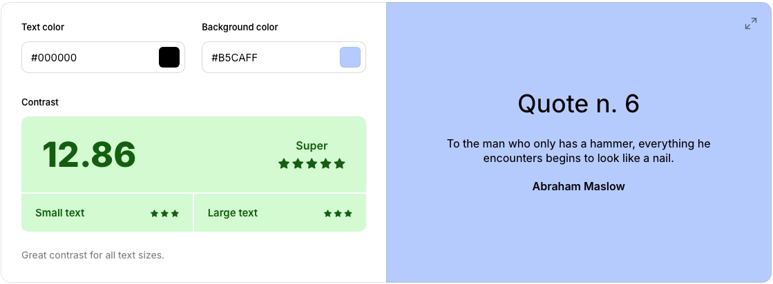
Contrast and Accessibility

Courtesy of coolors.co
Contrast Ratios
- Against White (#FFFFFF): Poor contrast (not recommended for text).
- Against Black (#000000): Excellent contrast, suitable for readable text.
Accessibility Recommendations
- Use darker shades like #8faaff for text over a #b5caff background to meet WCAG 2.1 standards.
- Pair with high-contrast colors for buttons or interactive elements to ensure visibility for users with visual impairments.

